
Taking a human’s temperature is easy. Taking a pet’s temperature is similarly straightforward, if a bit rude. Taking a planet’s temperature, on the other hand, is much more of a challenge. The temperature isn’t the same everywhere, so one thermometer won’t get it done. Weather stations on land near population centers are relatively common, but remote areas and the vast oceans also need to be represented.
On top of this geographical span, researchers have to deal with the reality that various issues like equipment changes have to be accounted for to ensure that the data is consistent over a century or more.
A handful of teams around the world separately maintain surface temperature datasets, including NASA, NOAA, the UK Met Office, and the Japan Meteorological Agency. The differences between their results are so small that only climate scientists could find them noteworthy. They all show pretty much exactly the same amount of global warming over time. But this hasn’t stopped conspiratorial critics from claiming that temperature measurements are somehow manipulated to create the appearance of warming where none exists. (These critics never explain how this cabal of scientists got shrinking glaciers, rising sea levels, and migrating species to play along.)
Fortunately, there are many ways to study the accuracy of surface temperature datasets. One of those ways is to compare them with satellite measurements over the last few decades. But this, too, is trickier than it sounds. The most common and longest-running satellite datasets actually measure temperatures higher up in the atmosphere (which doesn’t behave exactly like the surface), the satellites have their own technical issues to account for, and the dataset extends over a series of different satellites that aren’t always easy to sync up with each other.
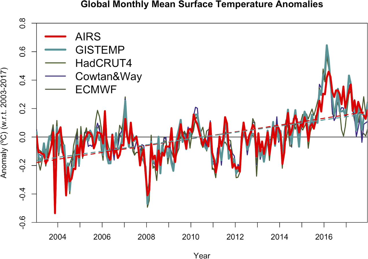
A new study takes advantage of a newer option: the Aqua satellite, launched by NASA in 2002. Among the instruments on this satellite is one that measures infrared radiation emitted by the surface of the Earth. This is different from the instruments on those other satellites, which measure microwave radiation emitted by gases higher up in the atmosphere. And with about 15 years of data from a single satellite, a clean comparison with the surface data is possible.
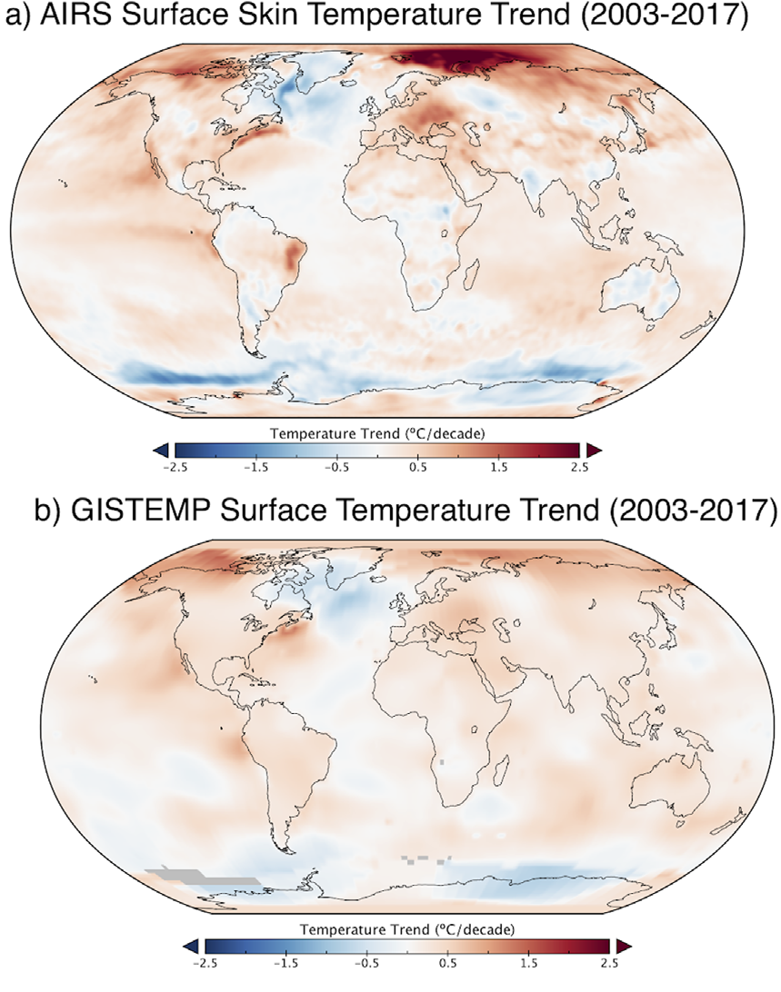
A team led by NASA’s Joel Susskind compared the Aqua satellite data with several surface temperature datasets. The results confirm (yet again) that the surface data is giving an excellent estimate of global changes, counter to the conspiracy theories. But because the satellite also measures areas where surface measurements are sparse, it shows what the surface data is missing.
Starting with the global average, there’s a solid match between the satellite and surface data sets at all time scales. The 2003-2017 period is short enough that you can expect small differences in the warming trend of each data set, but they’re quite close. And it’s the satellite data that shows the greatest warming trend, at 0.24 ± 0.12 °C per decade. The four surface data sets compared ranged from 0.17 to 0.22 °C per decade over that same period.
The biggest differences are in areas like the Antarctic, Arctic, and Central Africa, where surface measurements have to be extrapolated from a relatively small number of locations. In line with previous research, surface temperature data underestimates the satellite-measured warming trend in the Arctic. At the same time, portions of the Southern Ocean around Antarctica cooled a little more than was captured by the surface data.
The results shouldn’t be too surprising if you previously assumed that scientists could figure out how to work thermometers. But because those scientists have to sweat the details, this kind of research is a valuable cross-check that shows things are working accurately—but also where improvements can be made at the margins.
Environmental Research Letters, 2019. DOI: 10.1088/1748-9326/aafd4e (About DOIs).
reader comments
284